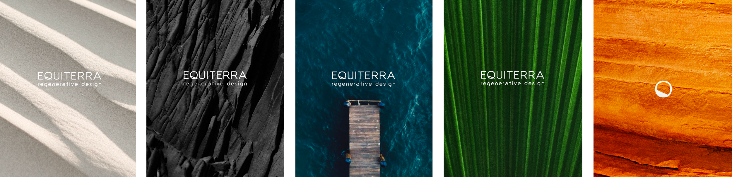

The new Equiterra identity incorporates dynamic natural patterns and imagery to better communicate the firm’s expertise in regenerative design.
Design as a lens.
As a firm practicing regenerative design in various ecosystems, environmental elements are not just a design consideration—they are inspiration. Equiterra's new graphic identity, based on a lens through which It sees the world, highlights the vibrant natural patterns that make up the brand palette.


Naming and Branding
Equiterra, a combination of “equilibrium” and “terra,” means “balanced earth” and represents the outcome this innovative architecture firm achieves through regenerative design.
Instead of selecting a basic color palette, we chose a variety of environmental elements to layer throughout the firm’s graphic identity.
Website
The new website features a homepage video showcasing a fast-motion sunset over a mountain range, and the starry night coming into focus. Natural patterns and textures are layered throughout the website imagery to reinforce the relationship between the firm and the earth.
Before and After
The original firm name and identity, Environmental Dynamic, Inc, was static, corporate, and didn’t accurately reflect the firm’s dynamic relationship with natural environments

“After 22 years as EDI, we felt it was important to refocus our energy on the values that originally inspired us. A shared passion for sustainable design brought our group together initially and we’re excited to see how the new brand helps us grow as thought leaders, reaching more people, and having a greater, lasting impact towards positive change for our environment and communities.”