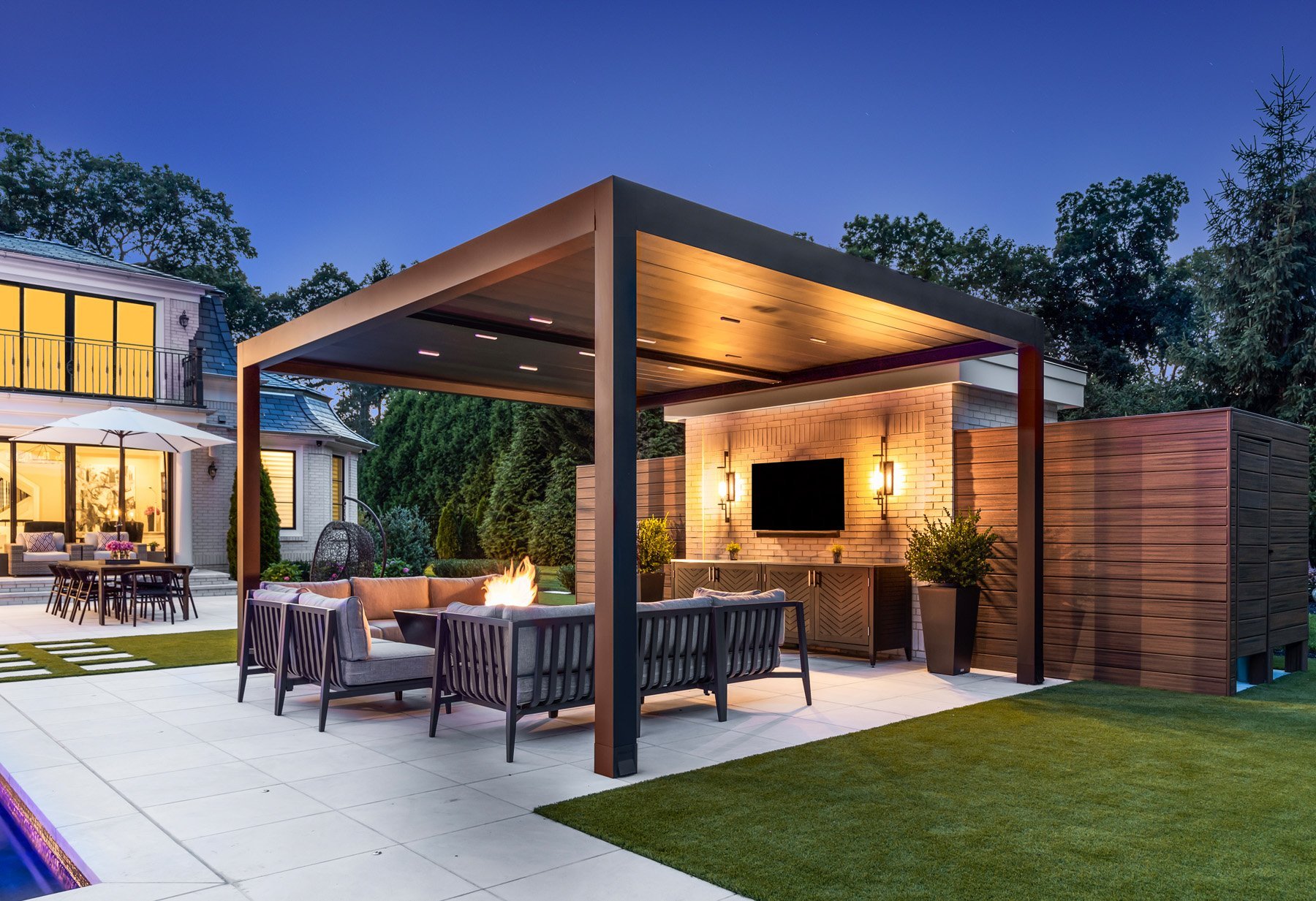
After 17 Years, Bayview was ready to rethink its brand, and everything was on the table, from the visuals to the functionality of how a new website could better support the prospective client journey.
A Holistic Approach.
The Bayview brand comes to life as Principal Greg Marett and Studio Manager Brian Paul take us on a tour of their office and one of their estate projects.
Branding
Bayview’s new look pulls together organic shapes and a nature-inspired color palette to reflect their obsession with the outdoors. Leaning into “Making the Outdoors More Enjoyable”, the visuals are playful, and a lowercase font communicates friendliness and approachability.

Web Design
Bayview’s website includes separate journeys for residential and commercial clients. It brings clarity to the process of working with the firm, including new tools like an FAQs page, a Landscape Architecture Experience Guide download, and a Cost Calculator, all designed so prospective clients can get their most pressing questions answered fast.
Before & After
Owner Greg Marett designed Bayview’s original logo, which was becoming increasingly difficult to use in digital applications because of its hand-drawn nature. The new logo brings sophistication to the brand, aligning it with the multi-million dollar estates and commercial landscapes the firm is known for designing.


