Founded in 1909, HRD needed a brand that could reflect their rich Atlanta legacy and still speak to a cutting edge healthcare and telecommunications clientele.
A hands on approach.
The old brand wasn’t clearly communicating the firm’s design innovation, tight knit culture, and hands-on approach they are well-known for to future clients and collaborators. A play on their acronym, the be heard tagline says it all and is a succinct intro to the firm’s mission statement. A rich, warm color palette and lowercase letters lend sophistication, confidence, and ensures hrd stands out amongst the competition.

Branding
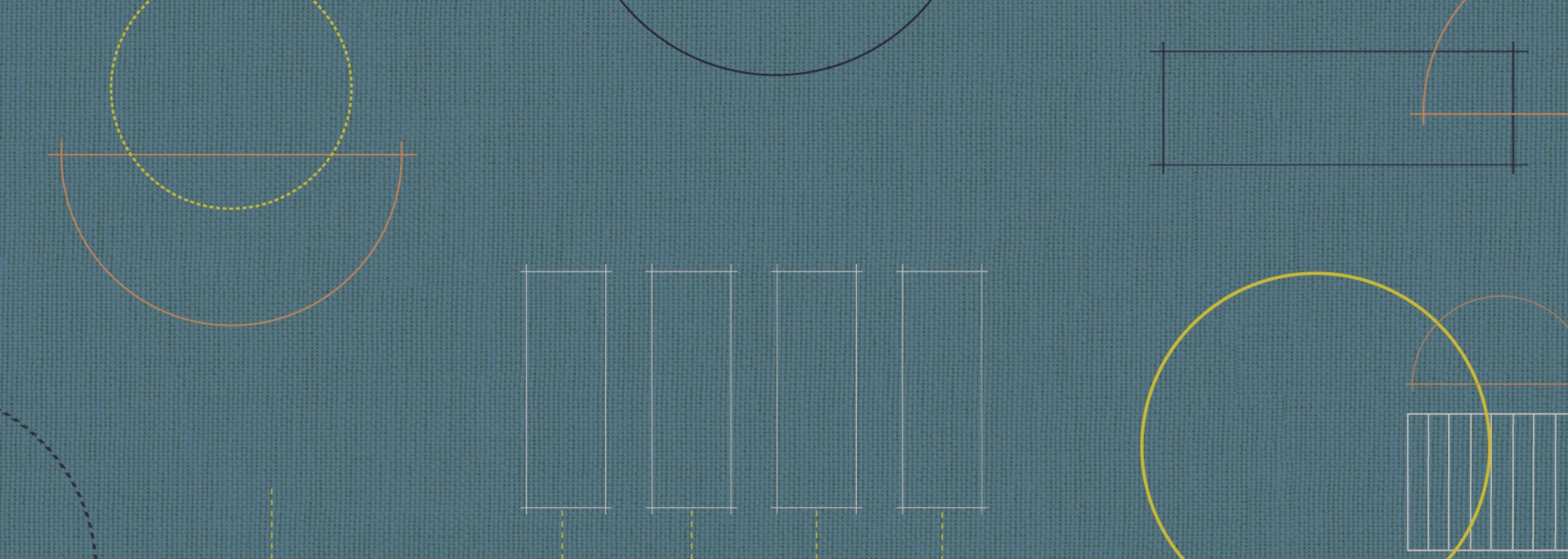
This modern visual identity is informed by old school tools of the trade. Blueprint, linen, and graphite ground a bright flash of chartreuse. Lush texture is used throughout, adding depth and warmth. The brandmark is based on a set of building blocks—three solid pillars that reference the firm’s history, dependability, and expertise are paired with lively curved elements—keeping their legacy alive while communicating freshness, vitality, and opening up infinite opportunities to have fun.
Web Design
Motion, depth and texture emphasize their mission to prioritize human connection, demonstrated further by bringing the full team to the main page. To showcase their long term relationships with clients and make specializations clear, projects are presented through a category-specific portal right alongside the firm’s iconic legacy work.


